One mark. One signal. No exceptions.
This is the whole identity, published. The rules below are not preferences, they are the reason every page, deck and product screen we ship looks like it came from the same company.
Version 1.0 · maintained in code
Three bars. Three layers.
The monogram is a blocky S cut from three stacked bars, each one a layer of what we build. The middle bar carries the accent, because the signal always sits inside the system, never on top of it.
- Strategy
- The decision layer. Set first, changed last.
- System
- The engineering layer. The only place the accent appears.
- Signal
- The growth layer. What the market actually sees.
Keep one bar height of empty space outside the mark on every side. Nothing enters it, no type, no rule, no image edge, no button.
Below 20 px the middle bar closes up and the S turns into a smudge, so 20 px is the hard floor. The site header runs at 28 px; anything larger is a display use.
The one place the rule below is suspended. An icon has no page to sit on: bare, the mark is lost against a light tab strip, and a pure black tile is lost against a dark one. So it carries its own surface: near-black, with a hairline that keeps the edge alive on either. And it rounds, because every operating system masks an icon into a rounded square whether we draw that corner or not.
The mark has one colour, one proportion and one orientation. If a layout needs it to bend, the layout is wrong.
Never recolour the mark
Never stretch or condense it
Never rotate or tilt it
Never box it in or round the corners, except for the app icon
Sayfi is the name. Tech is the job.
The wordmark is two ranks, not one word. SAYFI holds the weight and the full text colour. TECH steps down in weight, size and value, always present, never competing.
- Brand name
- SAYFI is what people say and remember. It carries the display weight and the only full-strength text colour in the lockup.
- Descriptor
- TECH says what business we are in. Lighter, smaller and dimmer, so the eye reads the name first and the category second.
Chakra Petch 600 · 0.14em · --foreground
Chakra Petch 400 · 0.78em · --muted-foreground
CSS uppercasing follows the language of the element. Under Turkish the browser maps i to İ, and the wordmark becomes a word we do not own. So the wordmark is authored in literal capitals and never carries a text transform, anywhere, in any locale.
Black canvas. One ember.
The palette is a single decision repeated everywhere: pure black holds the page, greys build depth, and vermilion is spent once. Every swatch below is painted by the same variable the product uses, so this page cannot drift from the code.
Depth comes from value, not from shadow. Each step up the ladder lifts a surface without introducing a new hue.
One accent per viewport. If a screen already spends vermilion on a button, the heading does not get it too.
- Systems compound.--foreground
- Systems compound.--muted-foreground
- Systems compound.--subtle-foreground
- --border
- --border-strong
- --grid-line
Structure is drawn with hairlines. Shadows are reserved for elements that genuinely float, which is almost nothing.
Four families, four jobs.
One display face for voice, one text family for everything readable, one monospace for data and labels, and an Arabic companion so the right-to-left build is a first-class citizen rather than a translation.
Right angles and restraint.
Nothing in the system is soft. Corners are square, edges are drawn, and movement exists only to explain a change, never to decorate one.
- Zero radius, everywhere
- Buttons, cards, inputs, images. A rounded corner anywhere is a bug.
- Lines over shadows
- Hairlines separate content. Elevation is a value change, not a blur.
- Motion earns its place
- One reveal on entry, one transition on hover. Reduced motion turns both off.
Corner ticks
The recurring frame motif. Two vermilion ticks on opposite corners confirm an element is interactive, without adding a single new colour.
- --duration-fast
- 160ms
- --duration-base
- 320ms
- --duration-slow
- 640ms
- --ease-out-expo
- cubic-bezier(0.16, 1, 0.3, 1)
- --ease-in-out-quint
- cubic-bezier(0.83, 0, 0.17, 1)
IGNITION.
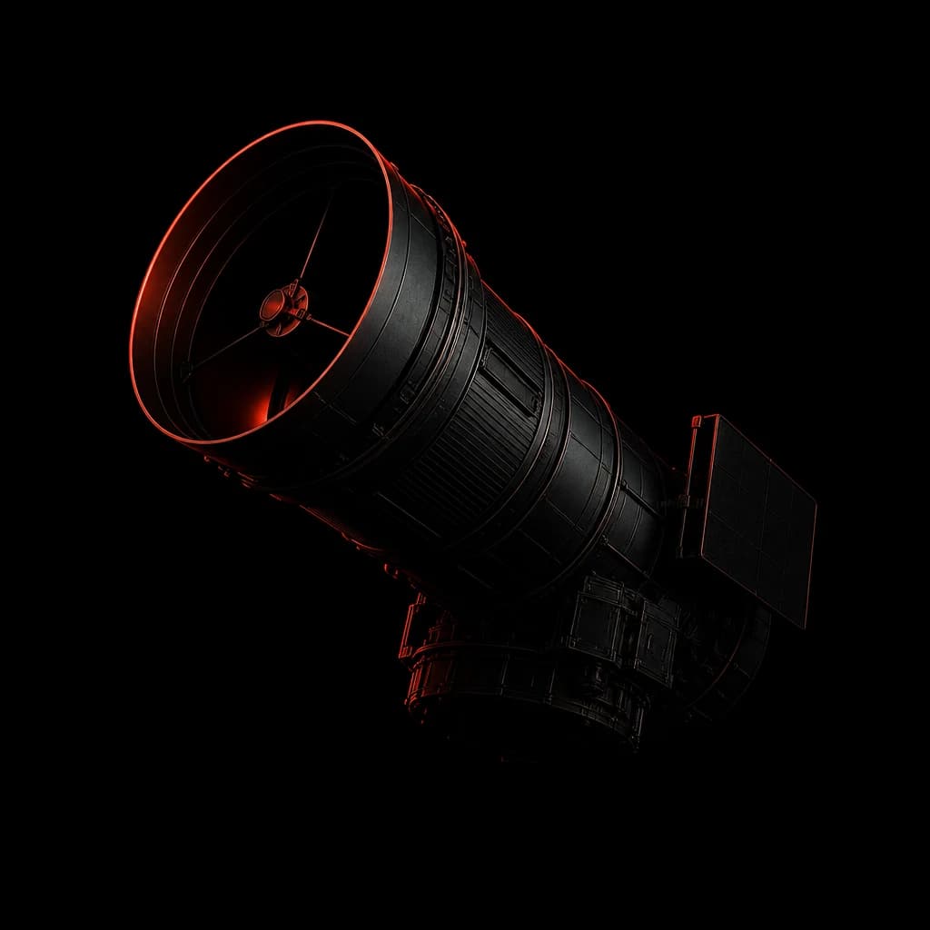
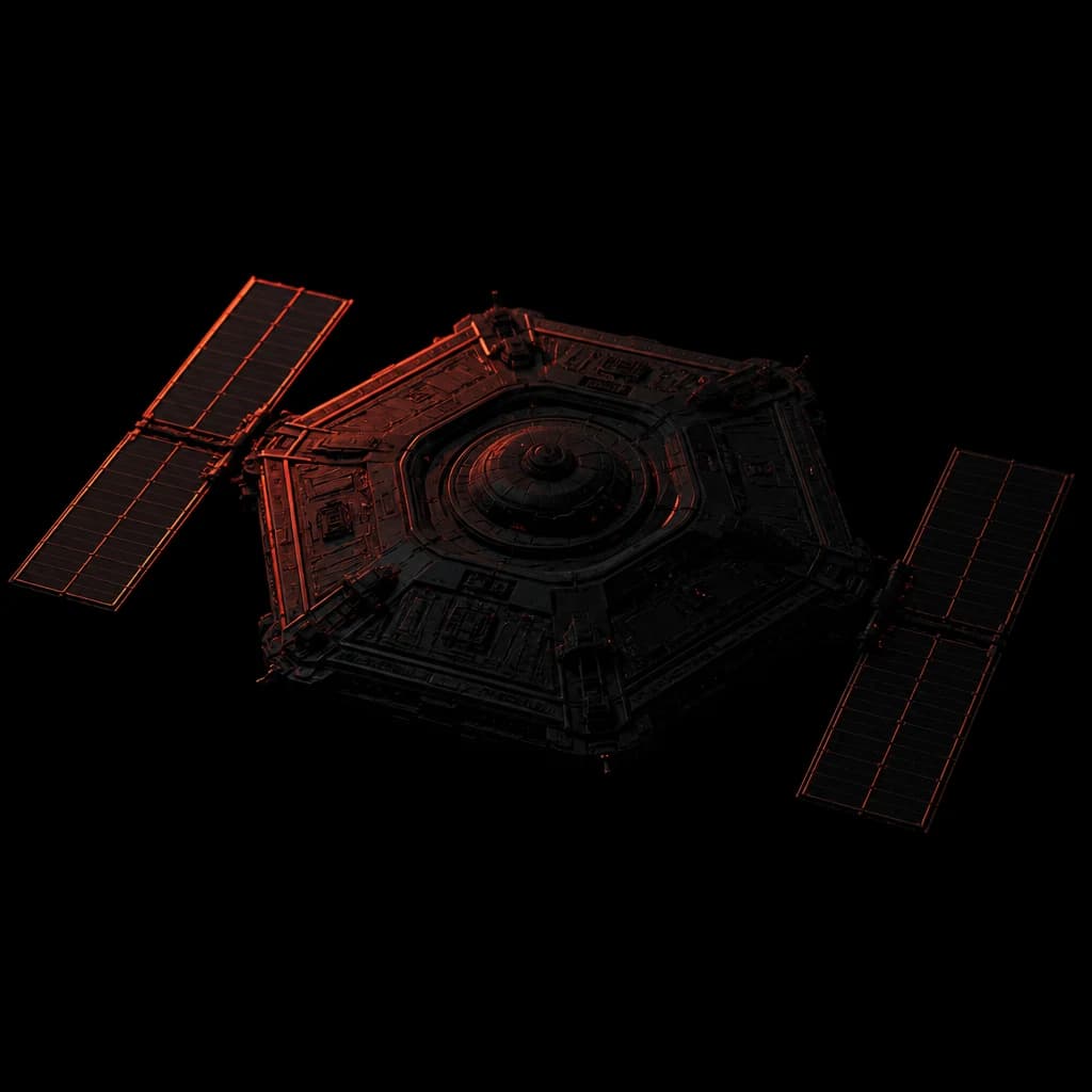
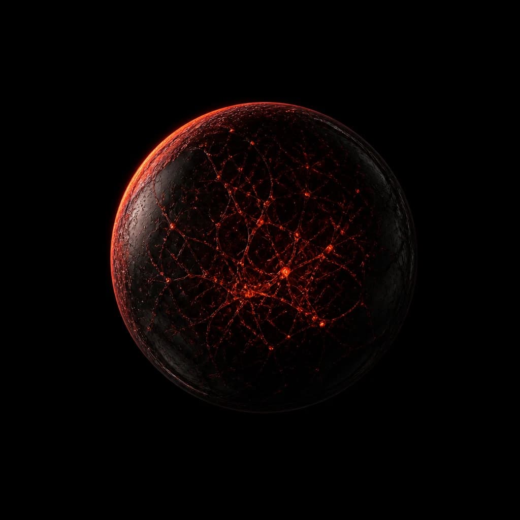
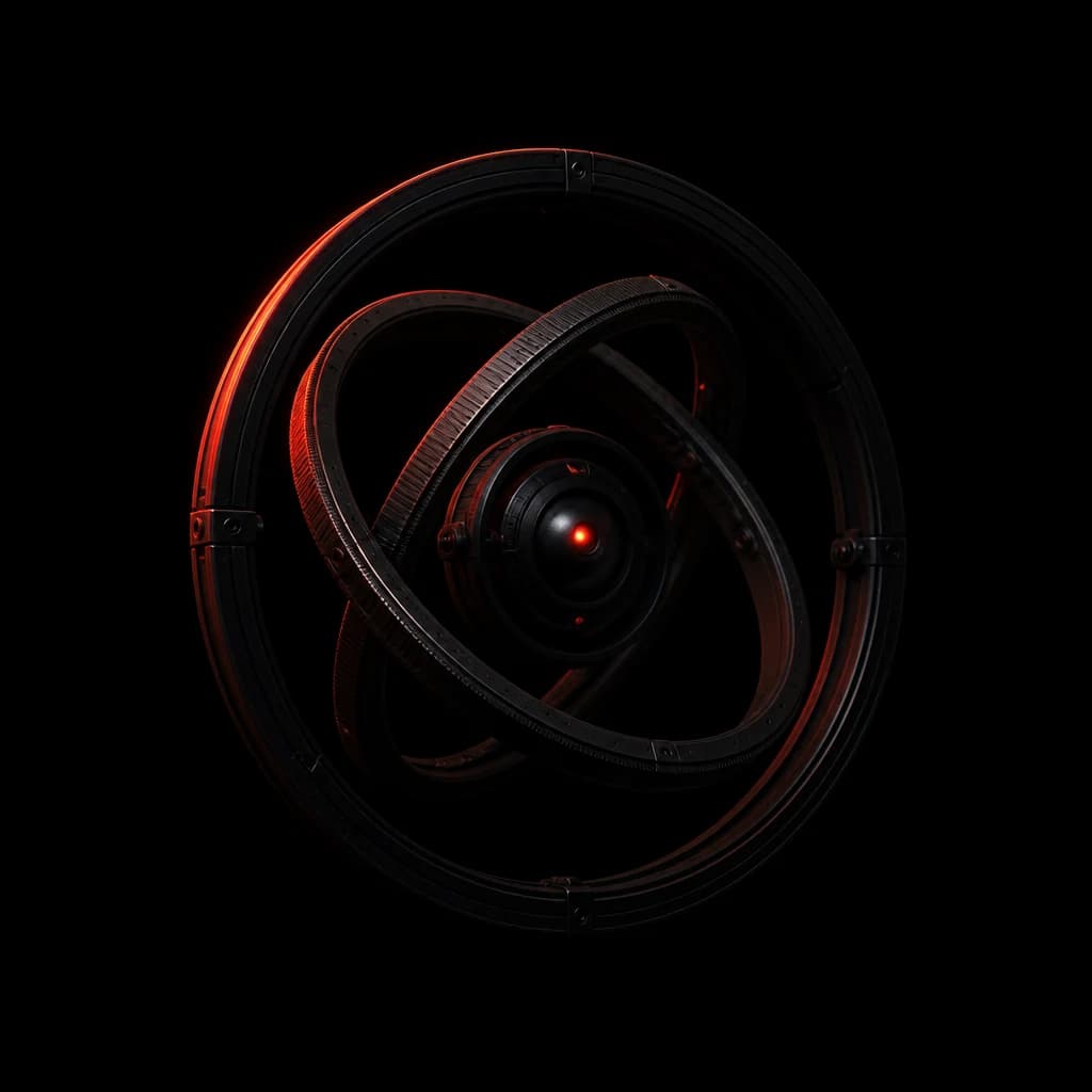
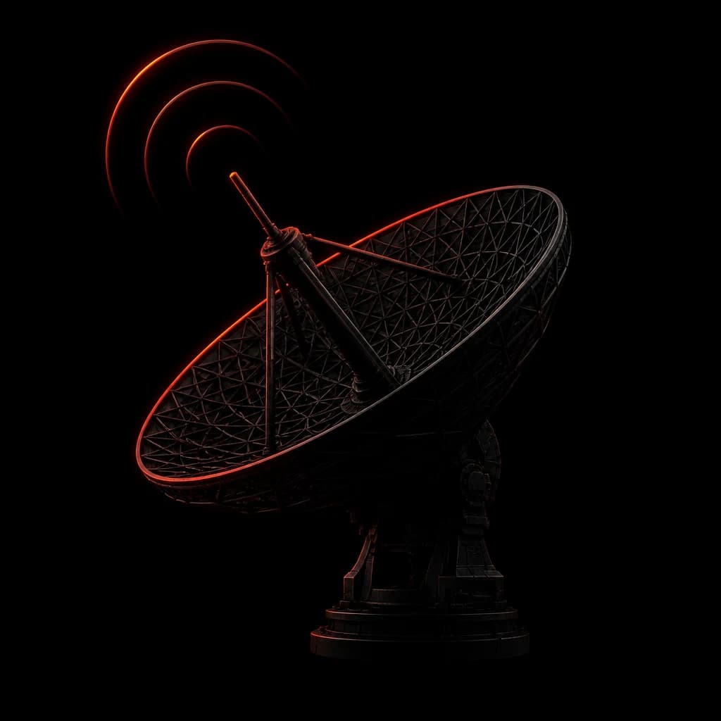
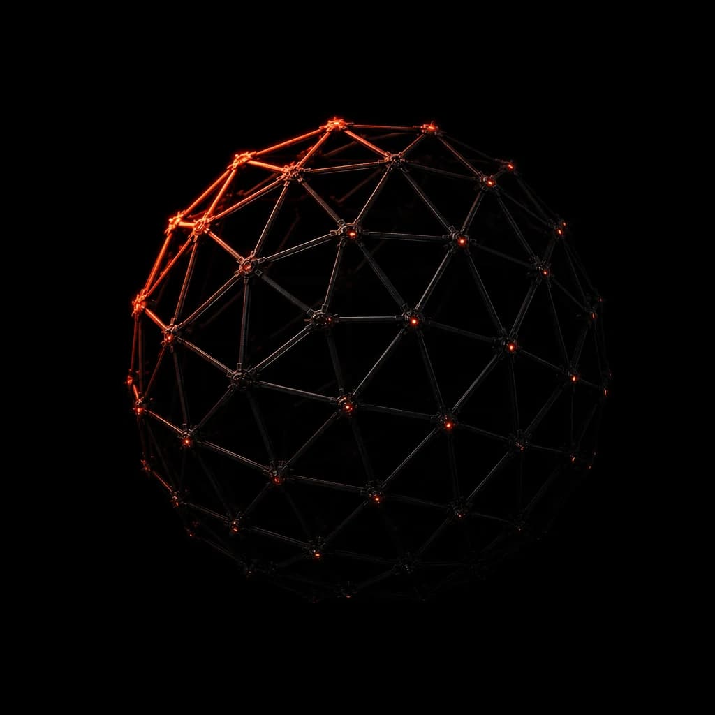
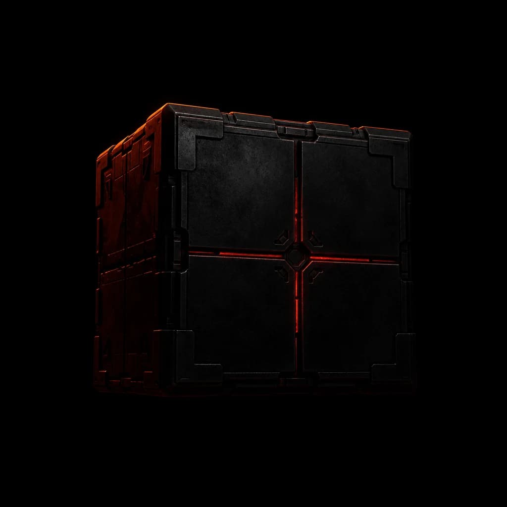
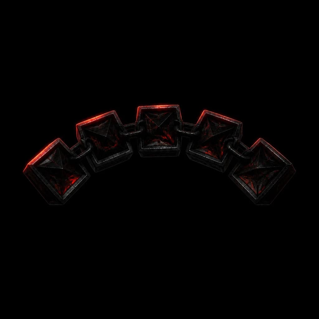
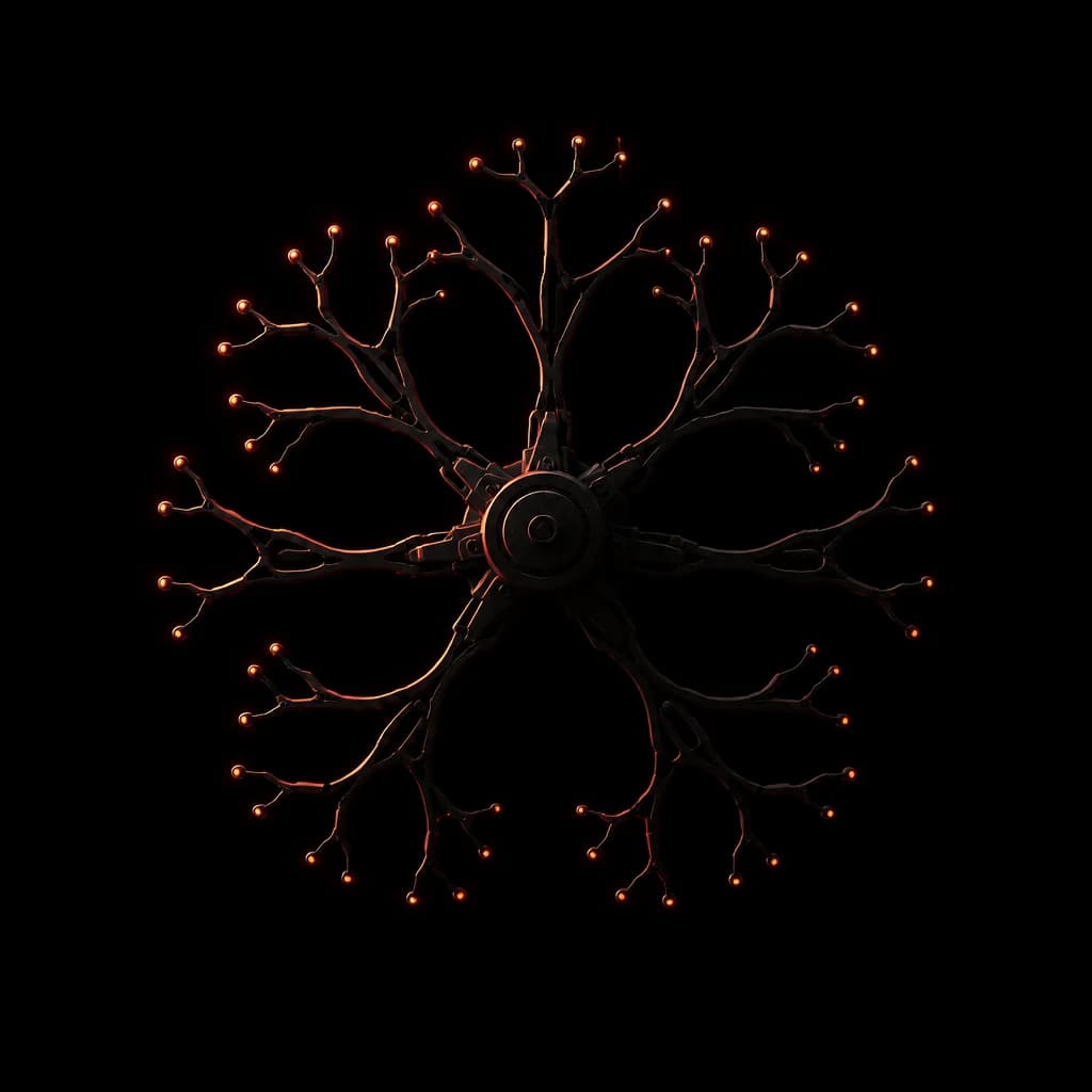
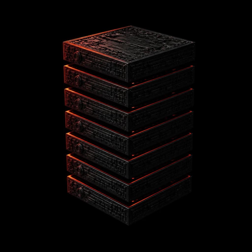
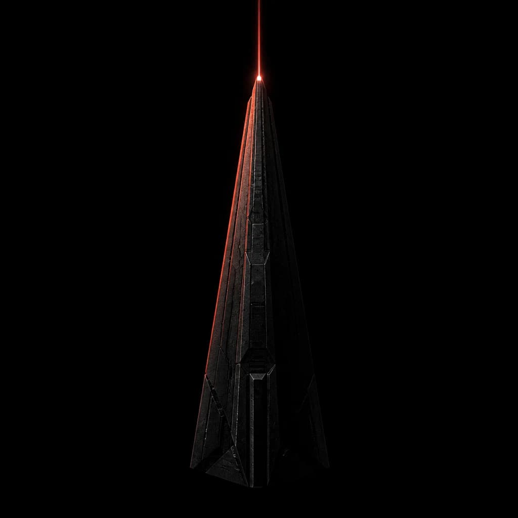
Hyperrealistic deep space, lit by a single ember rim light. The metaphor is literal: we build the systems that put companies into orbit, and the vermilion reads as thruster burn on a lit horizon. Every discipline owns exactly one object, and the file name always matches the slug.
- 01The background is pure black. Never a coloured or grey backdrop.
- 02One light source only, an ember rim light on the upper-left edge.
- 03Objects are dark charcoal machined metal, roughly 75% in shadow.
- 04Every category owns exactly one object, named after its slug.
- 05Art is square with deliberate margin, and is never cropped through the subject.
- 06No text, no logos, no stars, no floors, no reflections.
Eleven renders, one prompt skeleton. Swapping the subject clause is the only edit allowed.
Say it once, in plain words.
We write the way we would explain the work to a founder across a table. If a sentence needs a second reading, it gets cut.
Story first
Open with the problem the reader already feels, not with our credentials.
Short declaratives
One idea per sentence. One idea per block. Full stops do the work.
No jargon
A non-technical reader must understand every headline on the site.
Numbers or nothing
Claims carry a measured figure, or they do not get made.
- Campaigns end. Systems compound.
- Thirty minutes with an engineer, not a salesperson.
- Described in operator language, not as audited figures.
- Leveraging synergistic end-to-end solutions.
- Book a discovery call with our growth experts.
- Industry-leading, best-in-class, world-class.
Tell us what's slowing you down.
Fifteen questions, one screen at a time, and a verdict at the end. No call needed to get it.