Data visualization
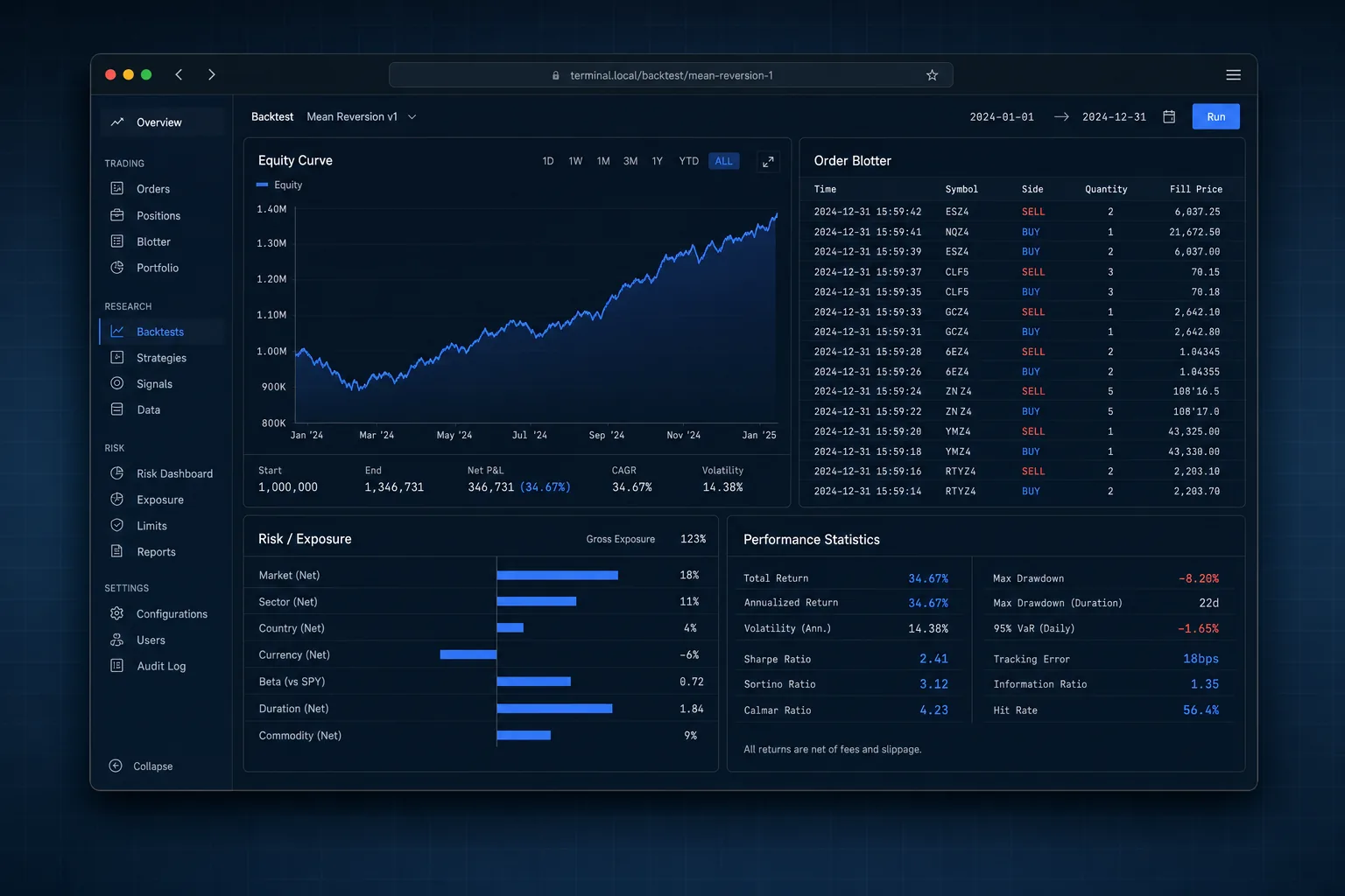
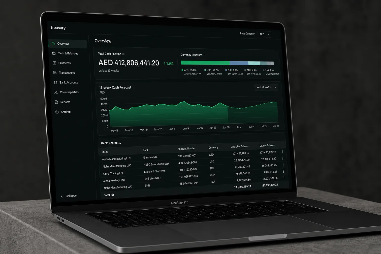
Charts and interfaces designed so the insight is obvious within three seconds.

- Engagement
- Fixed-scope design and build
- Typical timeline
- 4–6 weeks
- Starts with
- The last five reports your company sent to anybody.
A chart carrying fourteen series, two axes and a legend in the corner is not a chart, it is a puzzle. People nod in the meeting, remember nothing, and go back to the spreadsheet they already trust.
Reports people read instead of forward.
What we build
Concrete artefacts, handed over and documented.
- 01
A chart language for your organisation: which shape carries which kind of comparison, and the four chart types to stop using
- 02
A palette and type scale drawn from your brand system, checked for colour-blind readers and for a projector in a bright room
- 03
A component set built for your own front-end, so a chart inside the product matches the same chart in the board pack
- 04
Redesigns of the five reports your company circulates most, presented with the before and after side by side
What changes
A reader takes the point of a chart in seconds instead of studying it
Charts stop being redrawn from scratch for every deck
Internal and external reporting look like they came from one company
How it runs
- Weeks 1–2
01Audit the charts
We collect what your company actually circulates and mark every place a reader has to work out what they are looking at.
- Weeks 3–5
02Language and components
The rules, the palette and the built components, tested on your least cooperative dataset.
- Week 6
03Redraw
The five most-circulated reports rebuilt, with the reasoning for each change written beside it.
Chosen per project. Named here so you can see the shape of it.
- Figma
- D3.js
- Observable Plot
- Looker Studio
Questions we get asked
Tell us the outcome, not the tooling.
Send us the situation you are in. We will tell you which discipline it belongs to, what we would do first and what it costs, including when the answer is to wait.